This page is an indulgence – my reflections on how this website has evolved over the 20 years it has existed.
Four different names, nine different designs, a slow evolution in the content.
No-one else may be interested, but I’m enjoying the memories.
March 2006
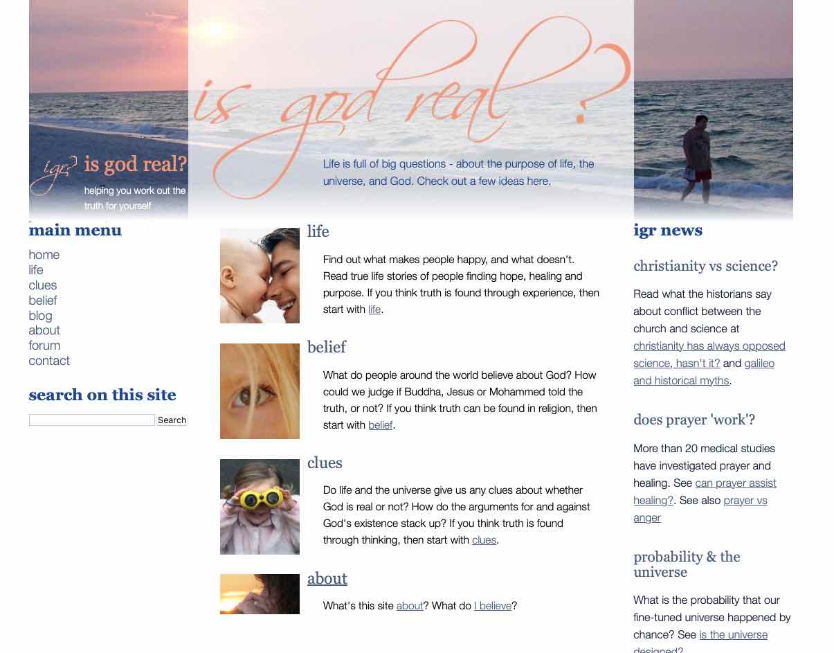
I had prepared some ideas on reasons to believe in God and I didn’t know what to do with them. But I wanted to share them with anyone who might be interested. So I thought it might be fun to start a website. I knew a little HTML (the language in which websites are coded). And my email host provided a free webspace. So why not use it?
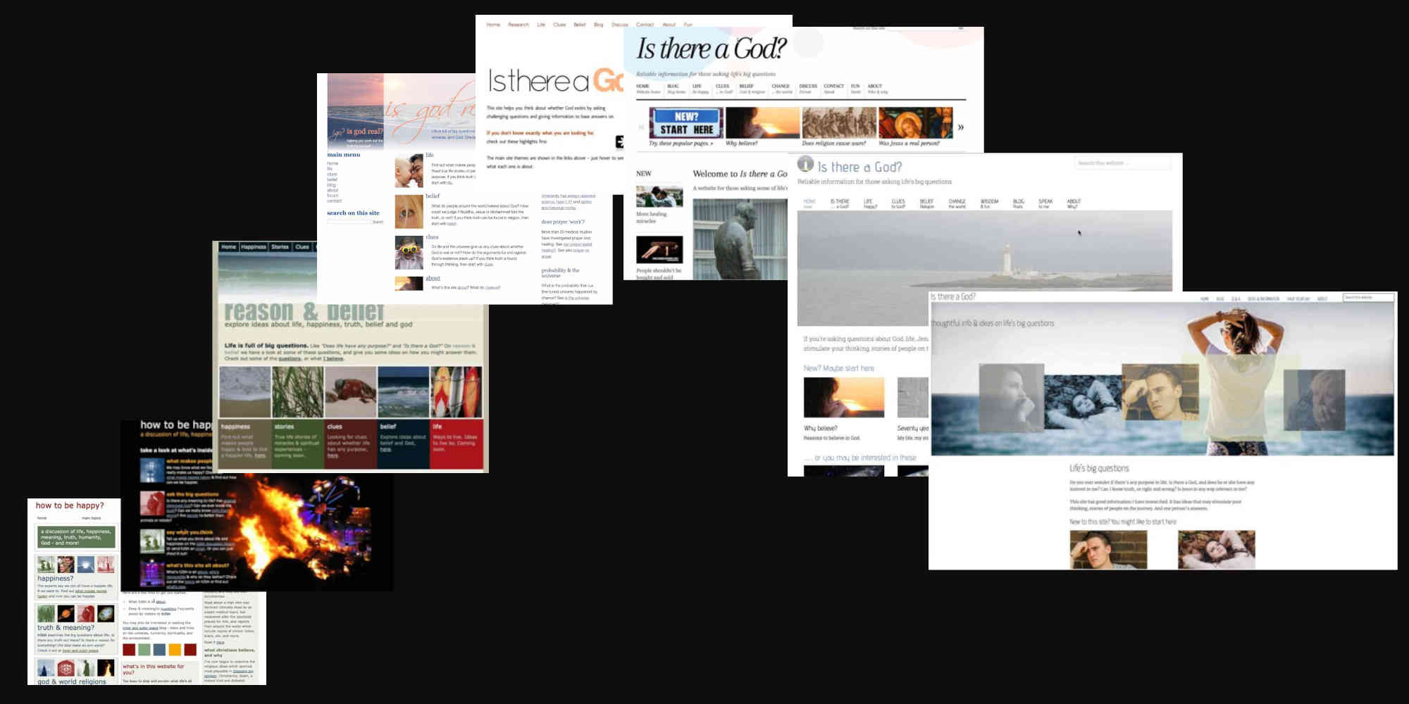
I chose “How to be happy” as a title because I thought I would focus on why belief in God makes for a fulfilled life. And since I had zero design skills, the design was mainly rectangles and some harmonious text colours I got from somewhere on the web. The pages looked very rudimentary.
Home page, 2006.
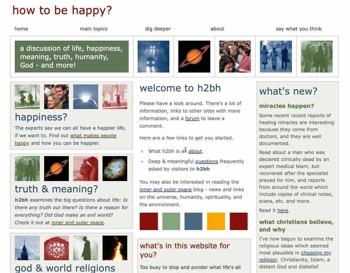
Typical page, 2006.
At this stage there were just 9 information pages, in order, like short chapters in a book.
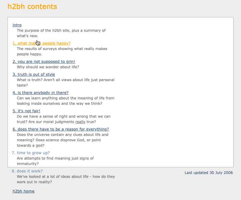
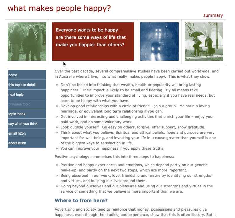
Contents, 2006.
Not long after I began, I was also able to add a discussion forum, using Vanilla forum software. I had hoped to make discussion a major part of the website, but it didn’t really get off the ground and eventually started to attract too much spam comments and I shut it down.
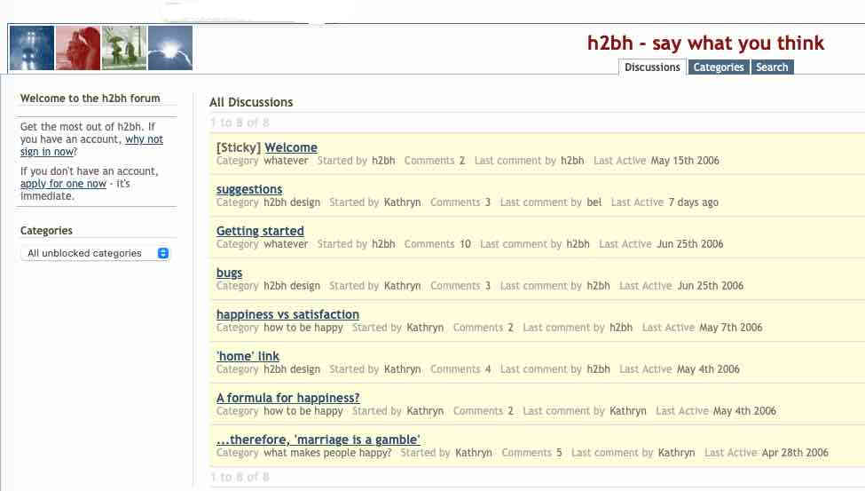
Discussion forum, 2006.
August 2006
I couldn’t help feeling my first design looked rather tame and cluttered. So why not try for something more dramatic? A home page with a black background and a dramatic, but irrelevant, photo looked attractive for a while, even though the remaining pages stayed the same.
I liked it for a while, but decided the graphics were really irrelevant to what the site was on about, so I reverted to the previous design.
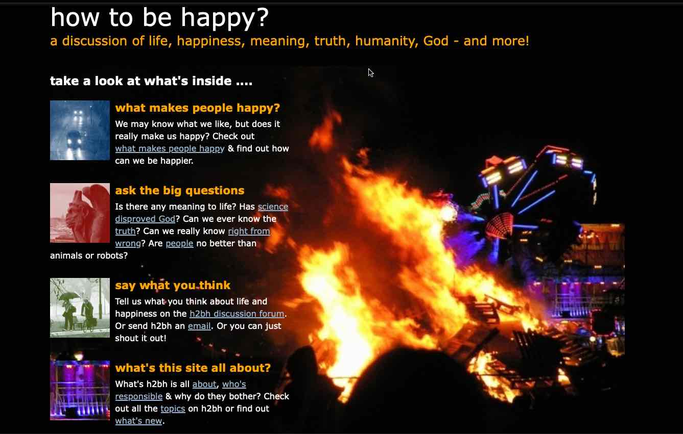
Home page for a short time in 2006.
May 2008
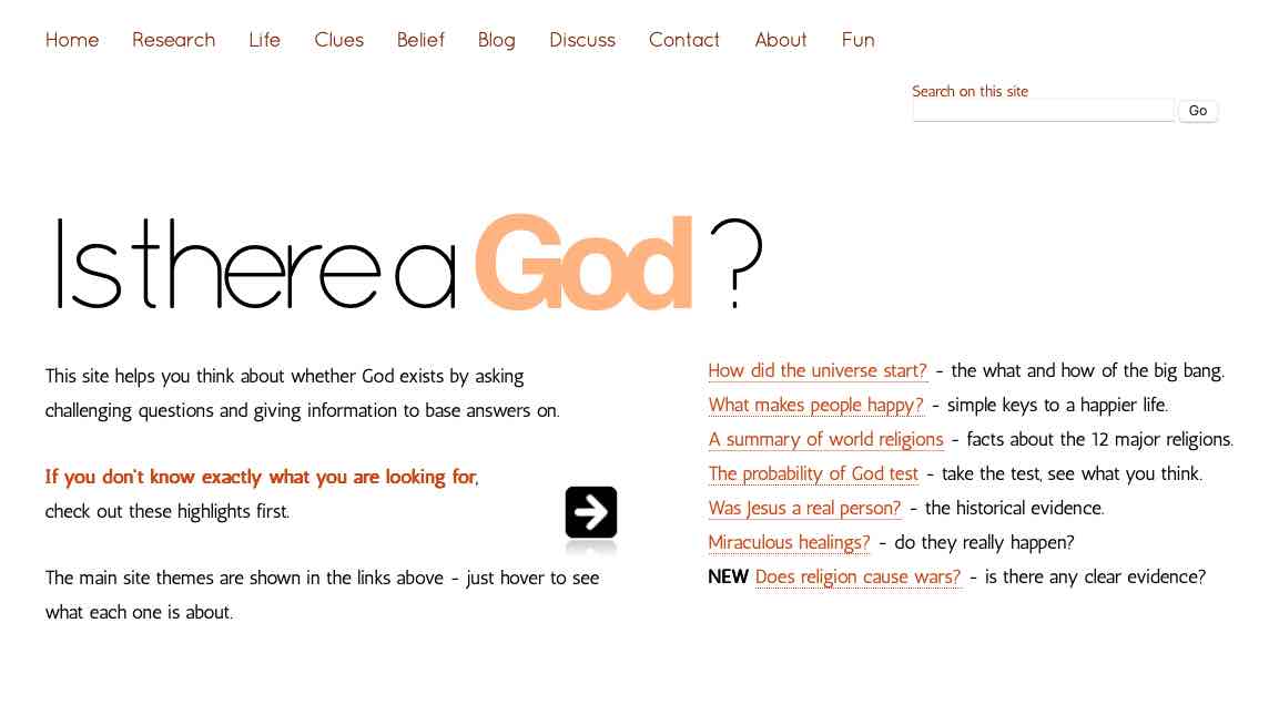
Around this time, arguments between christians and atheists were a thing. And the focus was often on the rationality, or otherwise, of christian belief. I of course felt belief was rational, the appropraite response to the evidence.
So instead of focusing on the connection between faith and happiness, I felt the connection between reason and belief was more important. So I changed the name of the website to “Reason and Belief”. And hoping for a less cluttered and more pleasing visual appearance, I used my own photos of the natural world to change the appearance and colours.
Almost from the start I had a been checking visit numbers using Google Analytics, and I quickly learnt that people don’t visit websites and read them through like a book, but rather tend to visit just the page they searched for, and occasionally a few more. So I divided the site into sections to cater for different people’s interests. These sections changed over time, but have always covered reasons to believe (“Clues”), life experiences and happiness (various titles) and religious belief (“Belief”).
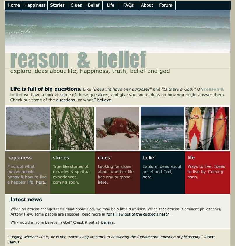
Home page in 2008.
The pages all now used their own colours and the same less cluttered design. I sort of thought having different colours for different sections was significant, though I’m not so sure why I thought that now.
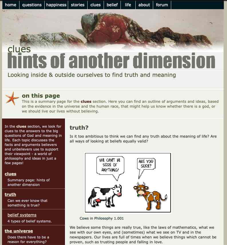
Clues section page in 2008.
An interactive quiz
Around this time I came across on the web a quiz where readers could answer several questions about God, life and the world, and their answers would be analysed for consistency. It was all aimed at showing the belief in God was inconsistent. I tried the quiz, the program that my answers were actually logical and consistent, which of course pleased me, but it gave me the idea to do something similar.
So I read up on a little philosophy, identified a bunch of arguments that were commonly used to argue for and against God belief. Then I used Bayes Theorem (which calculates probabilities) to produce a final probability, and then set up a few consistency tests of my own. Somehow I figured out how to program it all in php, and it worked (to my surprise). The Probability of God test has been on the site ever since the start of 2009, and hundreds of people have taken the test. Most seem to have liked it, but a few didn’t.
May 2010
More change! I still didn’t like name or the visual design, and I was learning all the time (design doesn’t come naturally to me).
I still had a forum on the site, but it wasn’t successful in keeping people involved. Most site visitors came from Google searches, so I needed to maximise how a small insignificant site like mine could rate on Google. A lot depends on the site name, and while “Reason & Belief” accurately described what I was on about, it wasn’t something anyone would search for on Google. So I decided to try “Is God real?” It was a question rather than a statement, which I liked, and it was a question some people were asking.
Visually, I decided that random graphics in different colours wasn’t what I wanted. People respond better to photos of people. So a visually simpler layout, based around colours of blue and tan, with appropriate people photos seemed a good way forwards.
And I added a blog, on Blogger, so it was a separate but linked site, hoping that I might gain some regular readers that way.
Home page, 2010-2011.
May 2011
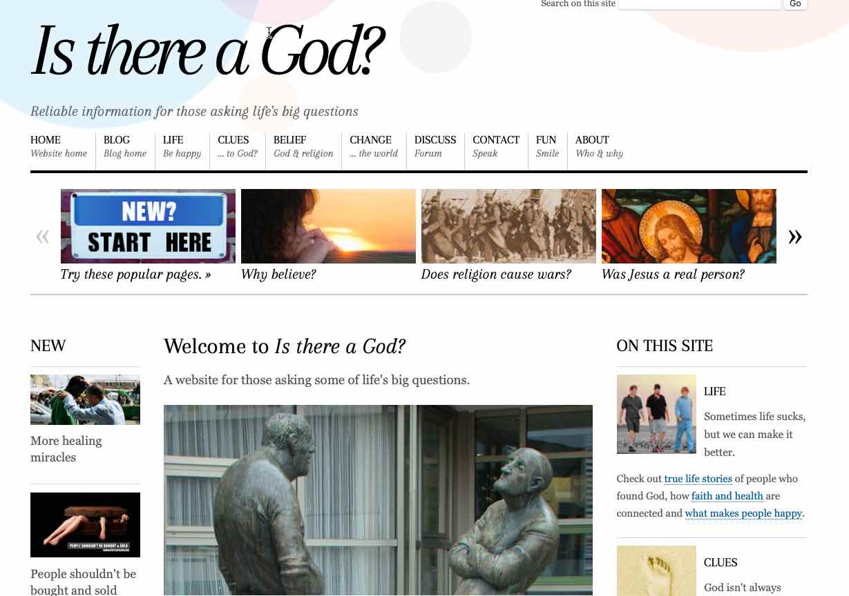
My website was now 5 years old and had been through 3 different names and 4 different designs. I was attracting about 150 visitors a week, but I felt I could do better. I decided I needed a new name, a new design, and my own URL, all of which might give me a higher Google rank.
I did a lot of research into which name might attract people who wanted to read what I was writing, and I decided on the current name, “Is there a God?”. I was then able to purchase a domain with the same name and begin to develop a whole new website.
I started out with a minimal design, just to get things started, but I knew I had to do better than that.
Home page, 2012.
June 2012
Over the next few months I re-started the blog using WordPress software on my own webspace instead of on the Blogger platform. After trialling a free WooThemes theme for a short time, I paid for the Responz theme by Themify, which looked a little like a print magazine and set it up for the blog. One of the big advantages (for me) of this theme was that the attractive appearance depended mostly on photographs (like a news magazine) and didn’t require any graphic design by me (which I wasn’t good at).
One of my main reasons for using a WordPress theme was the growth in internet use via mobile phones. This meant all sites had to be responsive to different size screens, and doing that all myself wasn’t going to be easy. So I could allow WordPress to do it for me.
But the main site was still written in HTML & CSS and I wasn’t ready to change it all over to WordPress, so with some difficulty and ingenuity, I sort of “reverse engineered” the theme appearance so the HTML site and the WordPress blog matched. It was a crazy thing to do, but I got it working.
Home page, 2013.
I was very happy with this design and used it for more than two years. And all the changes were successful! Visit numbers at the site rose to ten times over five years!
January 2016
After several years with this successful arrangement, it was time to bite the bullet and put all the website into WordPress. This wasn’t a simple undertaking – it required a lot of coding to get the usability I wanted without plugins which can slow the site down, every one of about 100 pages to be copied into WordPress and the whole site modified so the pages had the same URL as before. I outlined all these steps in Converting an HTML site to WordPress
I decided I needed a simpler site. A growing number of people were visiting the site by phone, which makes side columns less relevant, and anyway, few people used the links in the sidebars anyway. I chose a minimalistic theme in the Genesis Framework by Studio Press because it provided a lot of pre-programmed elements I wanted so I could do the coding in lieu of plugins, set up my own widget areas and add some other features.
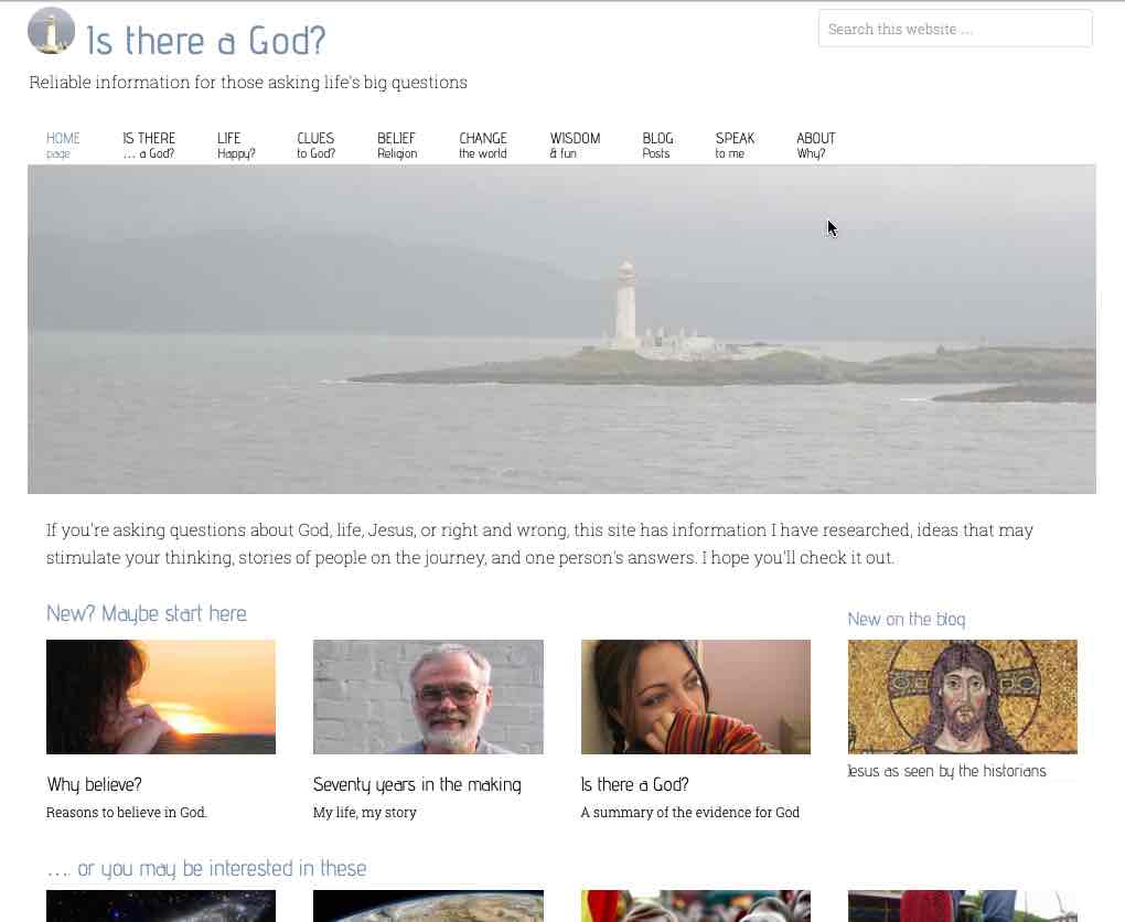
Home page, 2016.
October 2018
But I still wasn’t happy. I liked the grey photo of the Scottish loch with the lighthouse, but how was it relevant to the question “Is there a God?”? And did I really want the first view of my website to be grey?
So I kept fiddling, adding some colour to the top, then removing the photo altogether but was never relly happy with it.
Home page, 2018.
Around this time, I also made the decision to move my site from a host in Australia to a host in the US where more of my readers were located, to speed up loading times. I chose Inmotion as a company with a good balance of good service (reliability & speed) and cost. I haven’t regretted that choice.
August 2020
Finally in 2020 I arrived at my current design. A few factors were involved:
- My visit numbers, which had multiplied 10 times in the period 2011-2016, had tumbled by 75%. Was there something I could do to arrest this fall?
- Page loading speed seemed to be a major factor in Google ranking, and I wanted to get it above 90% on Google’s Page Speed Insights. Fully featured themes such as those I had been using were simply too slow.
- I have always had an interest in fonts. I have mostly felt that sans serif fonts work best on the web, but the Themify and Studio Press themes used serif fonts. I decided to change back.
So I chose the fastest theme I could find, the totally minimalist Arke theme by Danny Cooper at Olympus Themes. I then added the features I wanted by creating a child theme, and managed to get the site to mostly score around 90 on the Google page speeds, which is pleasing. And building on the idea that people’s faces are always interesting, and showing people thinking was possibly the most relevant graphic for a site like this, I made up the current home page graphic.
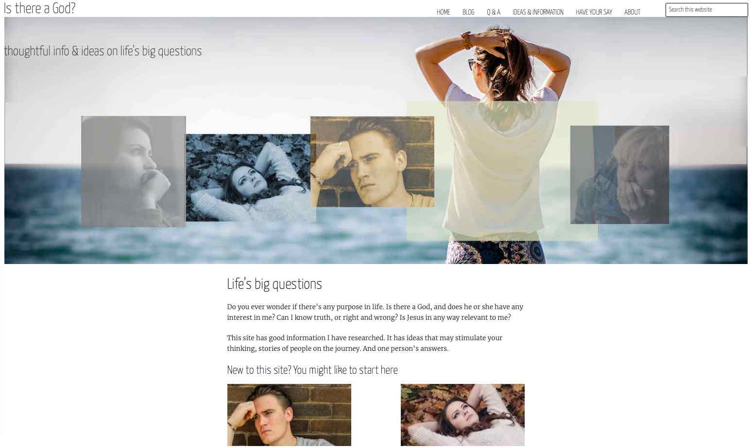
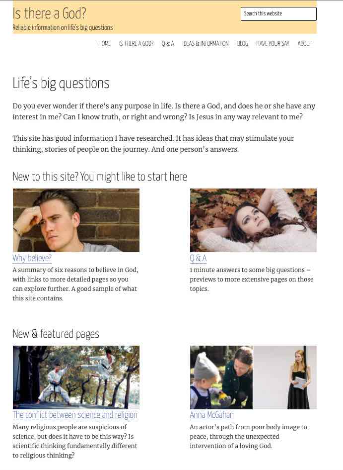
Home page, 2020 until now.
The future?
I don’t know how long I’ll keep this going.But I still enjoy researching it, and visitor numbers seem to be rising very slowly, so other people seem to be getting some value out of it.
I can imagine changing the home page graphic at some stage, to give it some more texture – more like it was created by an artist and less like an engineer! But I think future will mainly be streamlining the site and trying to address the most relevant issues.
Thanks ….
…. if you read this far. I hope it gave you some sense of the history and philosophy of this site, for whatever that may (or may not) be worth.